Picture this: You’re at a party, and someone asks what you do for a living. You launch into your perfectly crafted elevator pitch, dazzling them with your business acumen and charm. They’re intrigued and ask for more information. What do you do? If you’re like most small business owners, you probably say, “Check out our website!”
Congratulations, you’ve just made the digital equivalent of inviting someone to your house, then leaving them on the front porch to figure out how to get in and where to find the snacks.
In today’s digital age, your website is often the first point of contact between your business and potential clients. It’s your virtual storefront, your digital handshake, your online elevator pitch. And yet, so many businesses are squandering this golden opportunity by sending potential clients to their homepage – a generic landing spot that’s about as effective at converting leads as a fish trying to climb a tree.
In this deep dive, we’ll explore why homepages fail to convert, what the current sector stats are for SMBs on homepage conversions, why offer pages are needed, the importance of strong offers to hook new clients, why these pages should be “hidden” within the website, and how these offer pages need to be split tested. Buckle up, because we’re about to embark on a journey that will revolutionise your approach to online lead generation!
Section 1: The Homepage Conversion Conundrum
Let’s start with a hard truth: your homepage is probably about as effective at converting leads as a chocolate teapot is at brewing Earl Grey. But don’t worry, you’re not alone in this digital dilemma.
According to a study by Unbounce, the average conversion rate for small and medium-sized business (SMB) homepages is a measly 2.9%. That’s right, for every 100 potential clients who land on your homepage, only about 3 are taking the desired action. To put it in perspective, you have a better chance of guessing a stranger’s middle name than converting a visitor on your homepage.
But why are homepages so abysmal at converting? Let’s break it down:
1. The “Jack of All Trades, Master of None” Syndrome
Your homepage is trying to be everything to everyone. It’s like a Swiss Army knife – sure, it has a lot of tools, but none of them are particularly good at any one job. Your homepage is simultaneously trying to:
– Introduce your brand
– Showcase your products or services
– Highlight your team
– Display customer testimonials
– Provide contact information
– And probably a dozen other things
With so much going on, your potential client is more likely to feel overwhelmed than inspired to take action.
2. The “Where’s Waldo” Effect
Remember those “Where’s Waldo” books? Finding the specific information or call-to-action (CTA) a potential client needs on your homepage is often just as challenging. They’re looking for a specific solution to their problem, and your homepage is throwing everything but the kitchen sink at them.
3. The “One Size Fits None” Approach
Your homepage is designed to appeal to all of your potential clients. But here’s the kicker – different clients have different needs, pain points, and desires. By trying to appeal to everyone, you end up truly resonating with no one.
4. The “Shiny Object Syndrome”
Homepages are often filled with flashy design elements, auto-playing videos, and other bells and whistles that distract from the main goal – converting visitors into leads or customers. It’s like trying to have a serious conversation at a carnival – there’s just too much going on.
5. The “Choose Your Own Adventure” Dilemma
With multiple navigation options, links, and CTAs, your homepage is essentially asking visitors to choose their own adventure. But unlike those beloved childhood books, this adventure often ends with the visitor getting lost or frustrated and leaving your site altogether.
Section 2: The Offer Page Revolution
Now that we’ve established why homepages are about as effective at converting leads as a screen door on a submarine, let’s talk about the solution: offer pages.
An offer page, also known as a landing page or squeeze page, is a standalone web page designed with a single focus – to convert visitors into leads or customers. It’s like the difference between a Swiss Army knife and a surgeon’s scalpel – one tries to do everything, while the other is precision-engineered for a specific task.
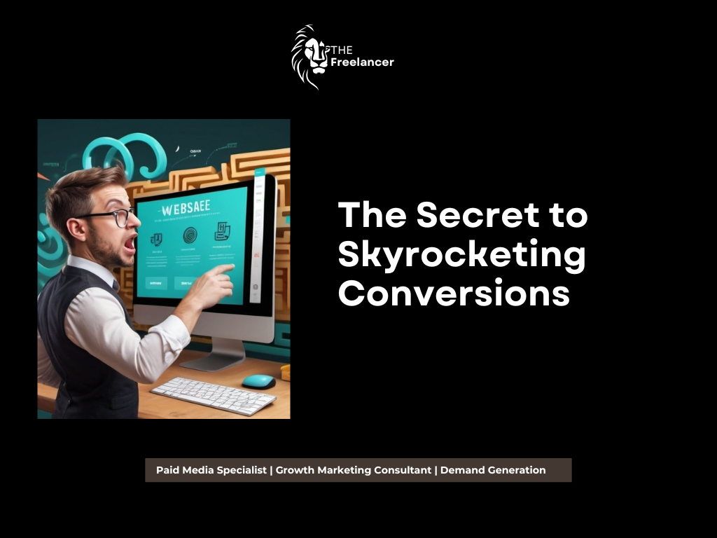
Here’s why offer pages are the secret sauce to skyrocketing your conversions:
1. Laser-Focused Messaging
Unlike your homepage, which is trying to be all things to all people, an offer page has one job and one job only – to present a specific offer to a specific audience. It’s like the difference between shouting into a crowded room and having a one-on-one conversation.
2. Distraction-Free Design
A well-designed offer page eliminates all the unnecessary elements that could distract from the main goal. No navigation menu, no links to other pages, no social media feeds – just pure, unadulterated focus on the offer at hand.
3. Clear Call-to-Action
On an offer page, there’s no confusion about what action you want the visitor to take. The CTA is clear, prominent, and impossible to miss. It’s like having a big, flashing neon sign that says “CLICK HERE FOR AWESOME!”
4. Tailored to Specific Audience Segments
With offer pages, you can create multiple pages tailored to different audience segments, addressing their specific pain points and desires. It’s like having a custom-tailored suit instead of an off-the-rack outfit.
5. Easy to Test and Optimise
Because offer pages are focused on a single goal, they’re much easier to test and optimise than a complex homepage. You can run A/B tests on different elements and quickly see what drives better results.
Section 3: The Art of the Irresistible Offer
Now that we’ve established why offer pages are the bee’s knees, let’s talk about what makes an offer truly irresistible. After all, you can have the most beautifully designed offer page in the world, but if your offer is about as appealing as a root canal, you’re not going to see those conversion rates soar.
Here are the key elements of an offer that will have potential clients throwing their contact information at you faster than you can say “lead generation”:
1. Solve a Specific Problem
Your offer should address a specific pain point or challenge that your target audience is facing. It’s like being a superhero who swoops in to save the day – except instead of a cape, you’re wearing a “problem-solver” badge.
2. Provide Immediate Value
The best offers provide instant gratification. Whether it’s a free ebook, a video tutorial, or a discount code, make sure your offer delivers value right away. It’s like offering someone a slice of pizza when they’re hungry – immediate satisfaction.
3. Make it Exclusive
Create a sense of exclusivity around your offer. Limited-time deals, members-only content, or early access to new features can make your offer feel like a VIP experience. It’s like being on the guest list for the hottest club in town.
4. Keep it Simple
Don’t overcomplicate your offer. The easier it is to understand and claim, the more likely people are to take action. Think “one-click ordering” rather than “assemble your own furniture.”
5. Address Objections Upfront
Anticipate potential objections and address them in your offer. If people are worried about giving out their email, assure them you won’t spam them. If they’re concerned about cost, highlight the value they’re getting. It’s like being a mind reader, but less creepy.
6. Use Social Proof
Include testimonials, case studies, or user statistics to show that others have benefited from your offer. It’s like having a crowd of people vouching for you, without the awkwardness of actually gathering a crowd.
7. Create Urgency
Use time-limited offers or limited quantities to create a sense of urgency. It’s like creating a “Black Friday” rush, but without the risk of being trampled.
Section 4: The Stealth Mode Strategy: Hiding Your Offer Pages
Now, you might be thinking, “Great! I’ll just plaster my offer all over my homepage!” Not so fast, digital marketing padawan. There’s a method to the madness of hiding your offer pages within your website. Here’s why:
1. Preserve the Integrity of Your Regular Pricing
By keeping your special offers hidden, you prevent existing clients from feeling like they’re getting a raw deal. It’s like having a secret menu at a restaurant – the regulars feel special for knowing about it, and the newcomers are delighted when they discover it.
2. Create a Sense of Exclusivity
When potential clients find your offer page through a specific ad or email link, they feel like they’ve discovered something special. It’s like finding a secret passage in a video game – it makes the experience more engaging and rewarding.
3. Tailor Offers to Specific Campaigns
By keeping offer pages separate from your main site navigation, you can create multiple offers tailored to different marketing campaigns without cluttering your site. It’s like having a wardrobe full of outfits for different occasions, instead of wearing everything at once.
4. Maintain Control Over Traffic Sources
When your offer pages are “hidden,” you have more control over how people find them. This allows you to track the effectiveness of different marketing channels more accurately. It’s like being a traffic cop, but for your website visitors.
5. Reduce Decision Fatigue
By not bombarding visitors with every offer you have, you reduce decision fatigue and make it easier for them to take action on the specific offer they’ve been presented with. It’s like going to a restaurant with a small, curated menu instead of a 20-page tome.
Section 5: The Split Testing Saga
Now that you’ve created your irresistible offer and cleverly hidden it within your website, it’s time to optimise the heck out of it. Enter the world of split testing, also known as A/B testing. It’s like being a mad scientist, but instead of creating monsters, you’re creating conversion machines.
Here’s why split testing is crucial for maximising the effectiveness of your offer pages:
1. Eliminate Guesswork
Split testing takes the guesswork out of optimisation. Instead of relying on hunches or personal preferences, you’re making decisions based on cold, hard data. It’s like having a crystal ball, but one that actually works.
2. Continuous Improvement
By constantly testing and refining your offer pages, you can achieve incremental improvements that add up to significant gains over time. It’s like compound interest, but for your conversion rates.
3. Understand Your Audience
Through split testing, you gain valuable insights into what resonates with your audience. You might discover that they prefer blue buttons over red ones, or that they respond better to emotional appeals than logical ones. It’s like being a mind reader, but with spreadsheets.
4. Maximize ROI
By improving your conversion rates through split testing, you’re essentially getting more bang for your marketing buck. It’s like finding a way to make your dollars stretch further at the grocery store.
5. Stay Ahead of the Competition
The digital landscape is constantly evolving, and what worked yesterday might not work tomorrow. Split testing helps you stay on top of changing trends and preferences. It’s like being a surfer, always riding the wave of what’s working now.
Here are some elements you should consider split testing on your offer pages:
– Headlines
– Subheadlines
– Body copy
– Images or videos
– Call-to-action buttons (color, text, placement)
– Form fields
– Page layout
– Social proof elements
– Urgency indicators
Remember, when split testing, change only one element at a time. Otherwise, you won’t know which change is responsible for any difference in performance. It’s like a scientific experiment – control your variables!
Conclusion: The Path to Conversion Nirvana
As we wrap up this epic journey through the land of offer pages and conversion optimisation, let’s recap the key points:
1. Your homepage is probably converting about as well as a chocolate fireguard. The average SMB homepage conversion rate is a paltry 2.9%.
2. Offer pages are the secret weapon in your conversion arsenal. They’re focused, distraction-free, and designed to convert.
3. Crafting an irresistible offer is an art form. Solve specific problems, provide immediate value, and create a sense of urgency and exclusivity.
4. Keep your offer pages hidden from your main navigation. It preserves your pricing integrity, creates exclusivity, and allows for better campaign tracking.
5. Split test everything. It’s the only way to truly optimise your offer pages and maximise your conversion rates.
By implementing these strategies, you’ll be well on your way to conversion nirvana. Your lead generation efforts will be more effective than a caffeinated squirrel on a mission, and your sales team will be busier than a one-armed wallpaper hanger.
So, the next time someone asks about your business, resist the urge to send them to your homepage. Instead, have a arsenal of targeted offer pages ready to deploy. Your conversion rates (and your bottom line) will thank you.
Now, if you’ll excuse me, I need to go create an offer page for “How to Write 3500-Word Articles Without Developing Carpal Tunnel.” I have a feeling there might be a market for that…